TAGS
A classic clothing and lifestyle brand, that makes shopping easy for people on the go.
Overview
In late 2016, Sunrise Brands hired me to assist in designing a new e-commerce store where users could browse and buy collections for their contemporary fashion label named TAGS. The brand aims to create a simplified model of shopping that supports the adventurous woman's lifestyle. TAGS manages their production locally as well as operate a single storefront here in Los Angeles.
Role
Research, Info Architecture, Ideation, Wireframes, Prototyping, UI Design, Art Direction
Team: 1 Designer, 1 Creative Director
Aug - October 2016
The Challenge
Luckily I had some experience working with e-commerce brands in the past. However, this would be the first project leading the brand's visual direction and creating a functional site that reinforced its business values: high-end, minimal, sophisticated, functional. Through this project, I was able to find the key to success for e-commerce UX - RESEARCH, RESEARCH RESEARCH. Listening to the people who will be using your site is an invaluable part of building a great product. Below is a detailed account of that process.

Discovery
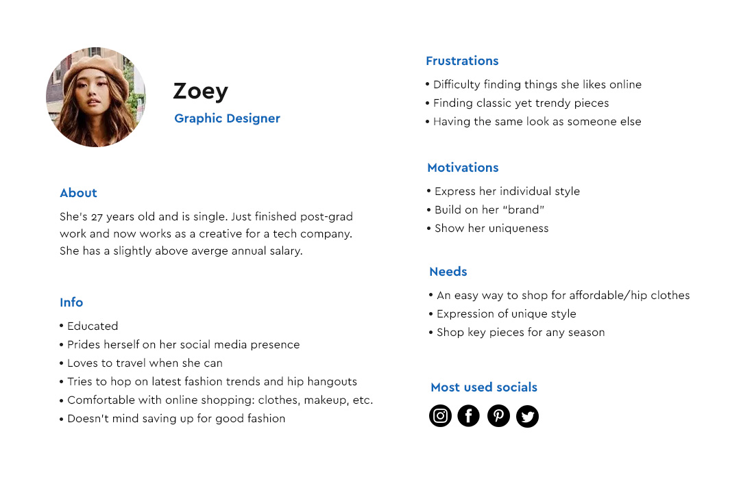
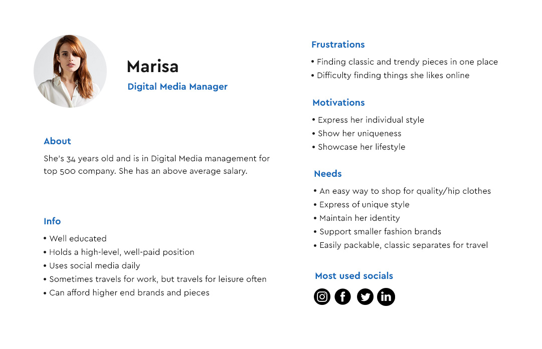
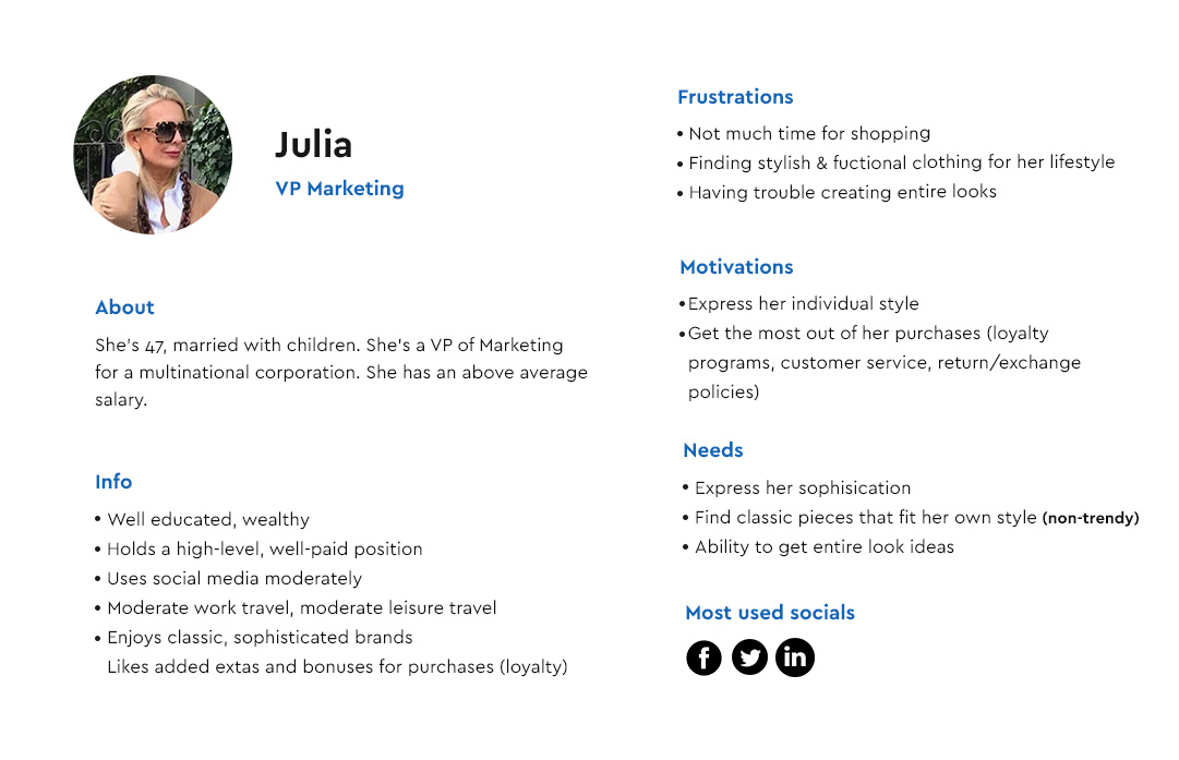
As a first phase of the design process, we canvassed the brick and mortar TAGS store and conducted interviews with people from the target audience. From this, we were able to identify three main personas.
Personas
As a first phase of the product design process, we carried out several interviews with people from the target audience and identified three main personas for this e-commerce UX project.
Identifying user needs
In an e-commerce project, research has to focus on the user's journey before, whilst in the act of, and after shopping. Based on information gathered about our user personas, we established user journeys to map their assumed experience.
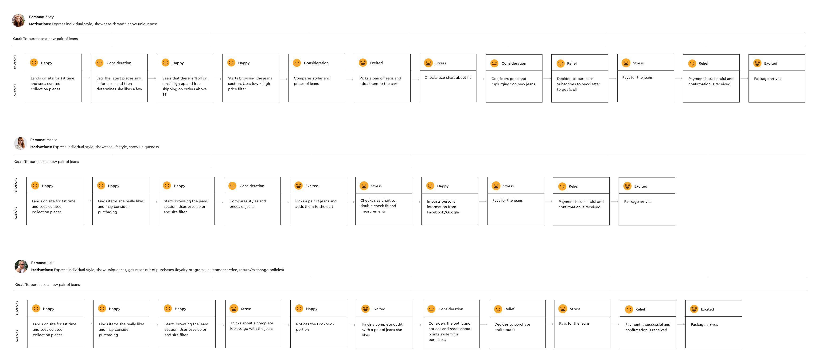
User journey key takeaways
- managed to identify and highlight many problems our customers faced at that time
- understood how they interacted with similar websites and what they expected from them
- discovered their pain points and learned more about what they felt at different stages of using an e-commerce store
- identified functional requirements and gathered ideas about how we could solve some of the problems.
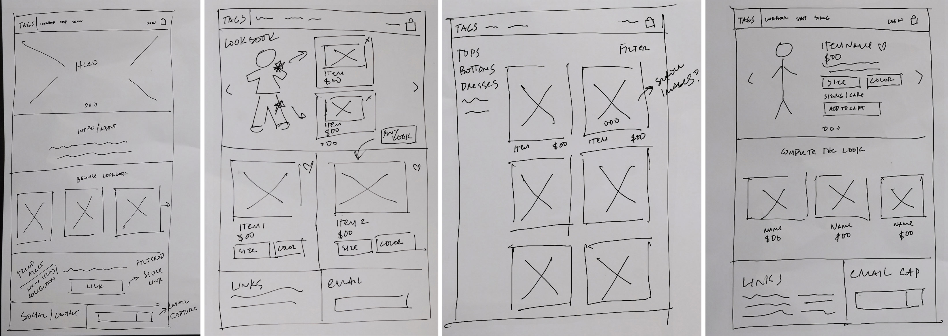
Ideation
After identifying, organizing, and assessing the information gathered in our research, we began mapping out the various components that target users would benefit from the most. Initial ideas were drawn (or scribbled) on paper and then progressed to a wireframe prototype for user testing.
Drawings
Brainstorming some initial concepts for the main site components proved to be very beneficial. Here are some results of early ideation sessions.
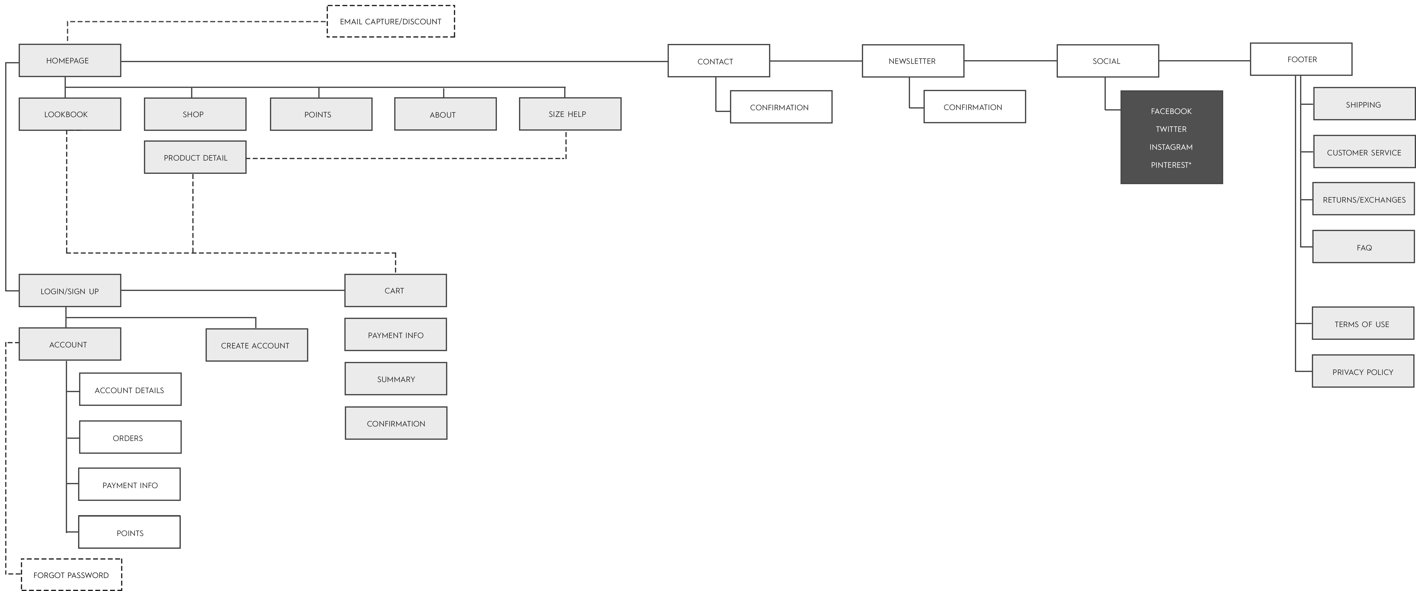
Information Architecture
After working with management to determine the merchandise hierarchy, we were able to define the overall structure of the website with a sitemap. This ensured that products would be easy for users to navigate and determine where to include valuable information such as size, points info, etc.
Mid-Fidelity Prototype
After we validated the main concepts, I created an interactive prototype with InvisionApp. We improved the prototype during many iterations, which I found really exciting. The user tests resulted in a lot of information, including valuable insights on how to solve users’ problems.
Usability Testing
I helped conduct several user tests in which users’ were asked to carry out typical ecommerce scenarios within iterations of the prototype. I've detailed a few of the iusses gathered from the tests and how they were ultimately addressed.
1. Something popped up
Issue
Taking into account our budget conscious persona, Zoey, we knew she would want to see any discount upfront. Our initial solution for email capture was hidden at the bottom of the page.
Solution
Though many e-commerce sites utilize full screen modals to prompt email capture, our tests found users were more likely to bypass them. Most were eager to start browsing content and felt this inhibited their progress. I decided to tweak the formula and added a sticky bar at the bottom of the browser which could still be impactful but not imposing.
2. Getting the fit right
Issue
A recurring point of anxiety for all our personas was fit. The consensus was that most ecommerce sites use a very general method of measurement (small, medium, large)
Solution
We wanted to create an easy-to-use size guide that compares different standards (including measurements in inches and centimeters) as well as how to measure for a particular garment, in this case jeans, for the best fit possible.
It was also iportant to include in the product details, the models height and the size of the garment they are wearing so users have a target comparison for their fit.
3. It's a look
Issue
One of the main pain points for our persona Julia, is creating a complete look. She finds that other sites only make individual suggestions on what to pair a garment with, but don't showcase an entire outfit on a model that she can then purchase.
Solution
We came up with an idea to have a curated lookbook that would be more editorial based on looks for the rotatinig seasons. This not only gives the outfits context, but also allows the user to purchase every item in the look simultaneously.
Brand Elements
Before jumping into the UI design, a crucial step was to establish the key visual elements that would breathe life into the site. Working off the existing logo and brand values guide, I was better able to navigate through finding what colors and typography would work best to encapsulate the ease of the brand.
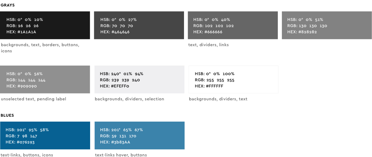
Colors
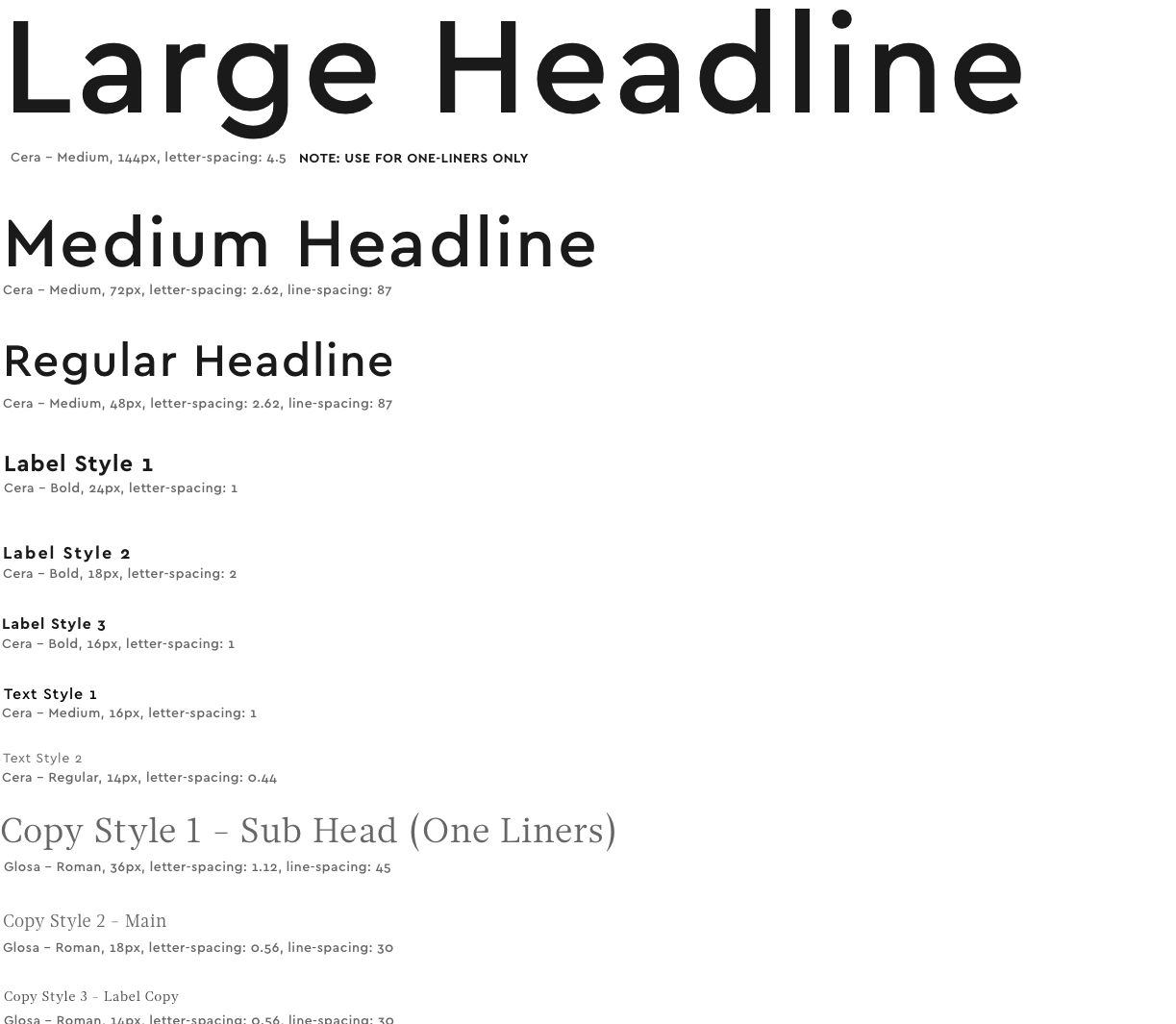
Typography
Icons
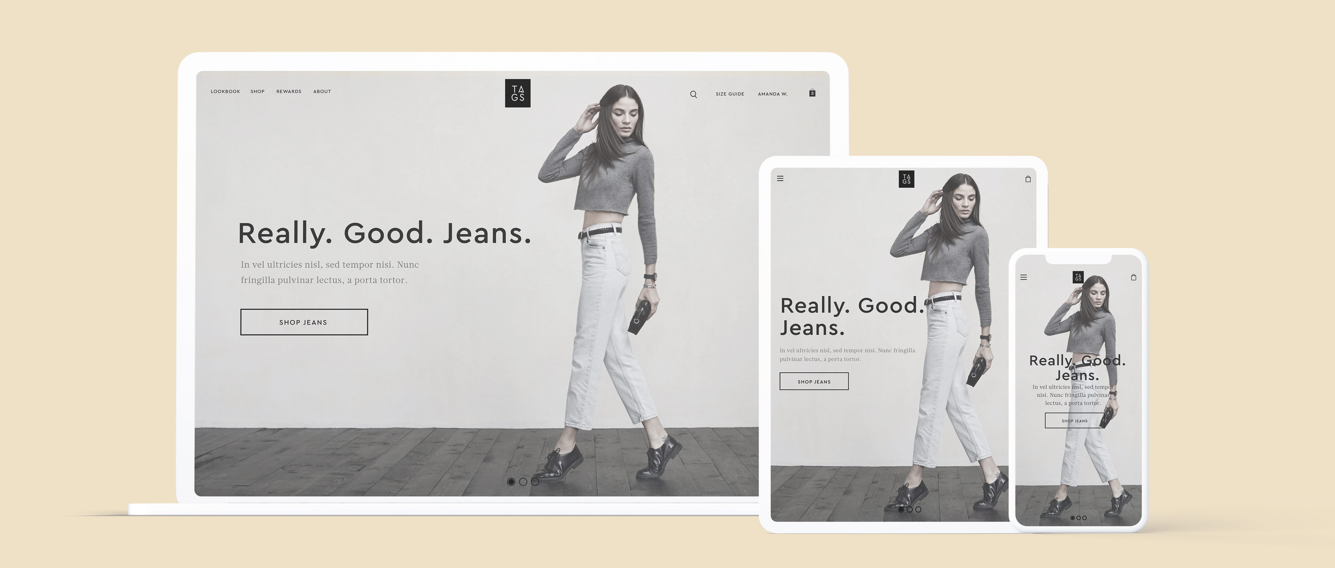
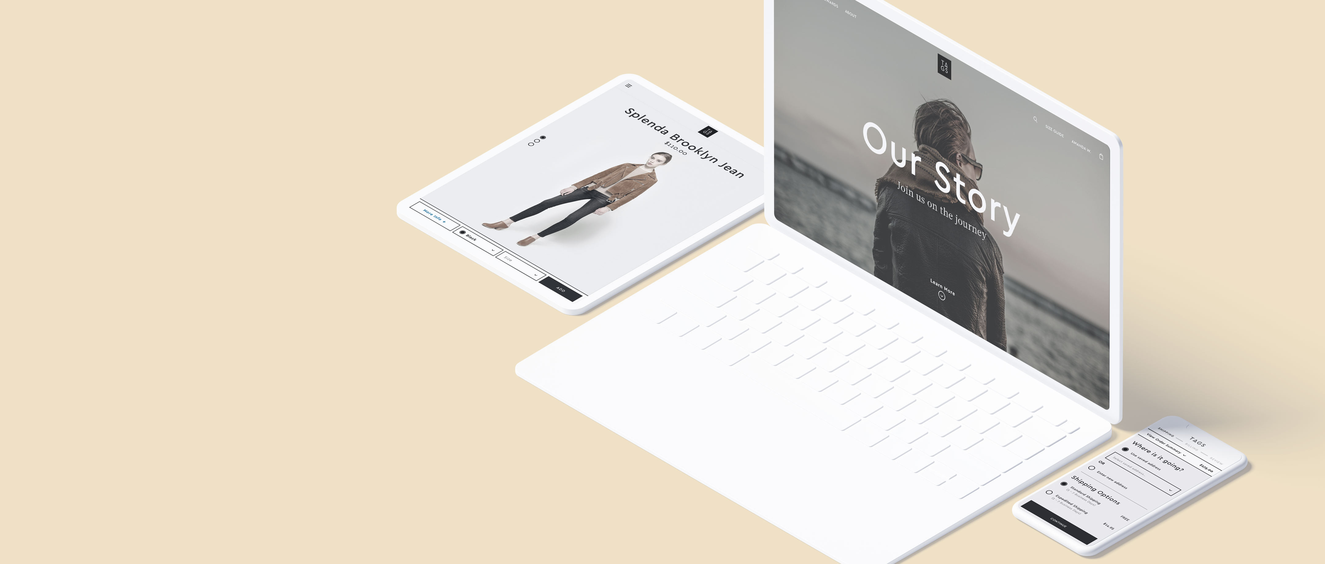
UI Design & User Flows
Once we managed to develop solutions for user problems and define the brand style, I began designing the final user interface.
Since the TAGS customer would likely consume content exclusively on a mobile device, I decided to take a mobile-first approach to the interface's more function-driven aspects.
I also considered the brand values (high-end, minimal, sophisticated, functional) and merged that with our persona needs.
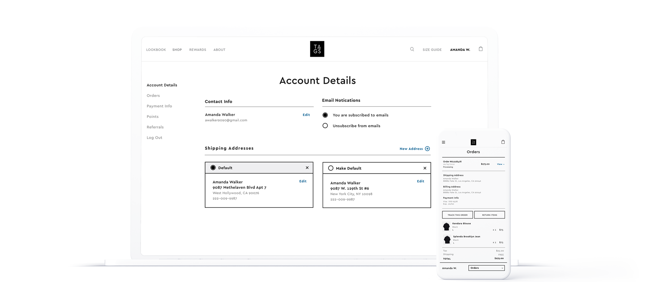
Account
Where users can store personal data like payment information and addresses for future purchases. Also included is a detailed view of points earnings and usage and an explanation of the referral program.
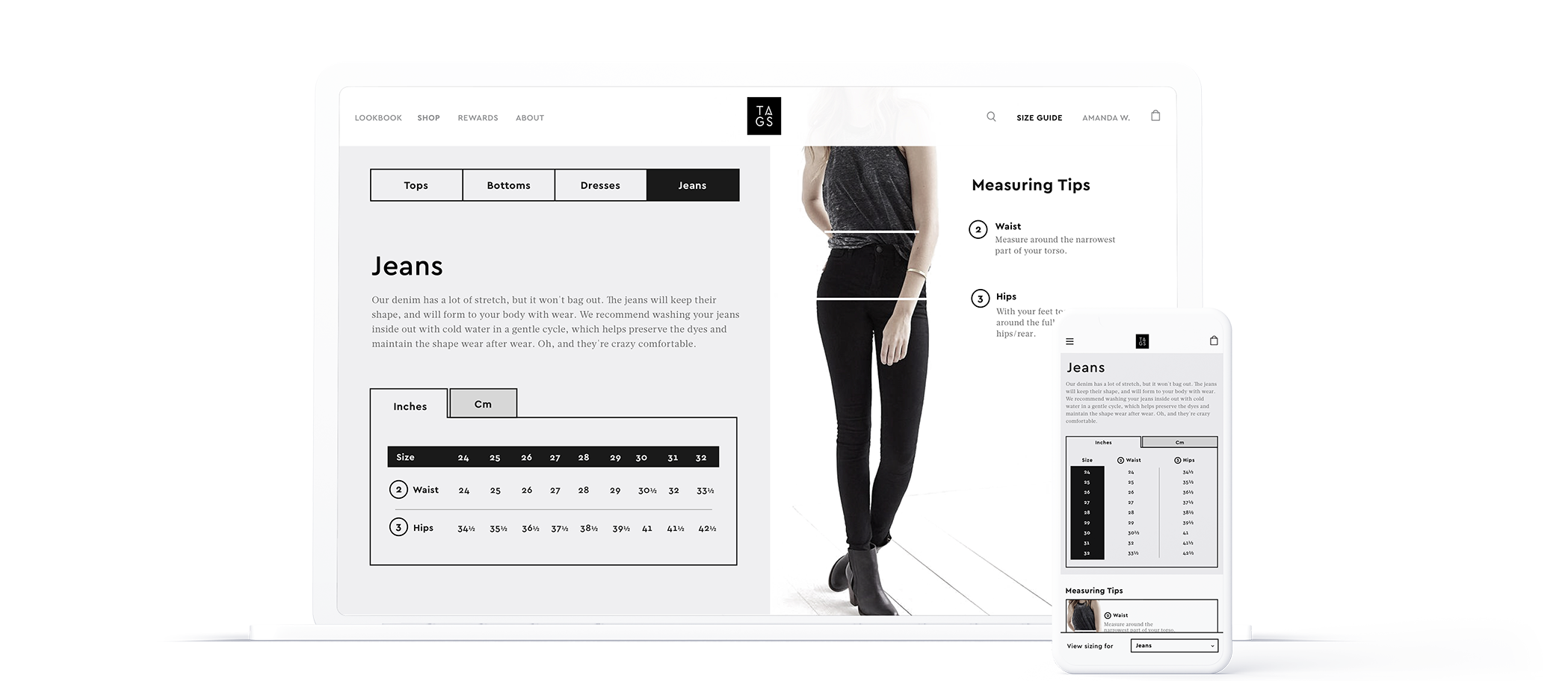
Size Guide
A comprehensive guide to sizing across multiple articles of clothing. Also provided are tips on how to measure for particular items. The guide is also readily available for users on the the product details page.
Lookbook
A curated set of styles and accompanying photographs to assist in purchasing complete looks from head to toe. From each slide, users can buy only certain pieces that they like or the entire outfit.
Points Info & Earnings
Informational page that details ways in which users can earn points towards future purchases. This links into the users account to show their current balance of points and those pending.
Shop & Checkout
Making the shopping and checkout experience as seamless as possible was a critical UX component to address for TAGS users. The flow addresses all the pain points for our identified personas - namely discounts, points, and sizing.
Key Takeaways
Working on the TAGS site was a truly gratifying experience. I learned a great deal about both the fashion industry and e-commerce UX. Research played an insurmountable part in guiding the design of the site. Without the help of data generated from our product users, we wouldn't have been able to create an easy-to-use tool for them.
Taking risks and experimenting with feature sets you think users will respond can pay off in the end. For example, some users require outfit suggestions, so rather than only utilize a "Suggested Items" component, we thought it'd be best to include a curated style guide to better help with this.