Behind the Shield Mobile
An easy to use mobile intranet app with map integration
Overview
In early 2018 I was assigned to create a tool that would conflate certain aspects of the Warner Bros. employee intranet, Behind the Shield, with a heavily requested digital studio map. Behind the Shield Mobile, the final solution allows for an easy way to search for employee events, people, and news while also containing a robust map tool.
Role
Research, Ideation, Wireframes, Prototyping, Interaction, Visual Design
Team: 1 Designer, 2 Product Managers
Feb - April 2018
The Problem
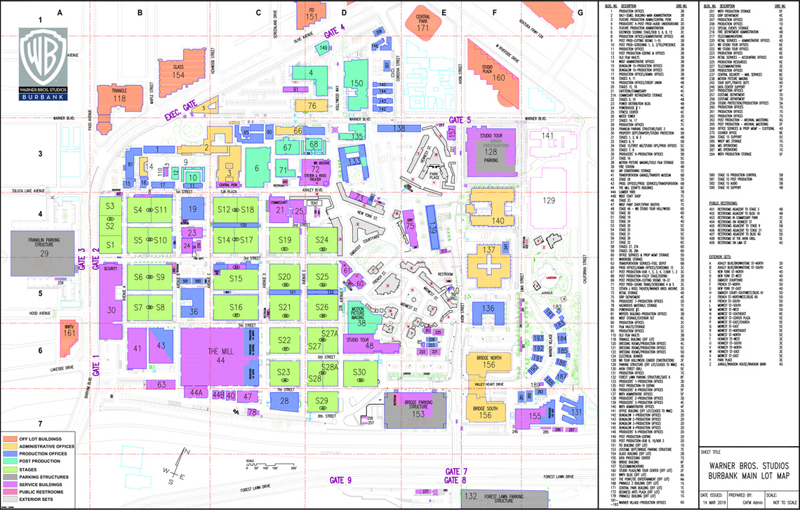
By the time I began working at Warner Bros., there had been a good deal of frustration from both guests and employees with current methods of getting around the studio. The only option at the time was to use a paper map or to ask someone on the studio lot for directions. Upper Management had thrown around the idea that it would be beneficial for users to create a digital tool to navigate the studio. Once the map project was green-lit, the conversation also came to include how to integrate the newly launched Warner Bros employee intranet Behind the Shield. I was selected to take on the task of designing out both components and merging them into one seamless and intuitive application.
The Solution
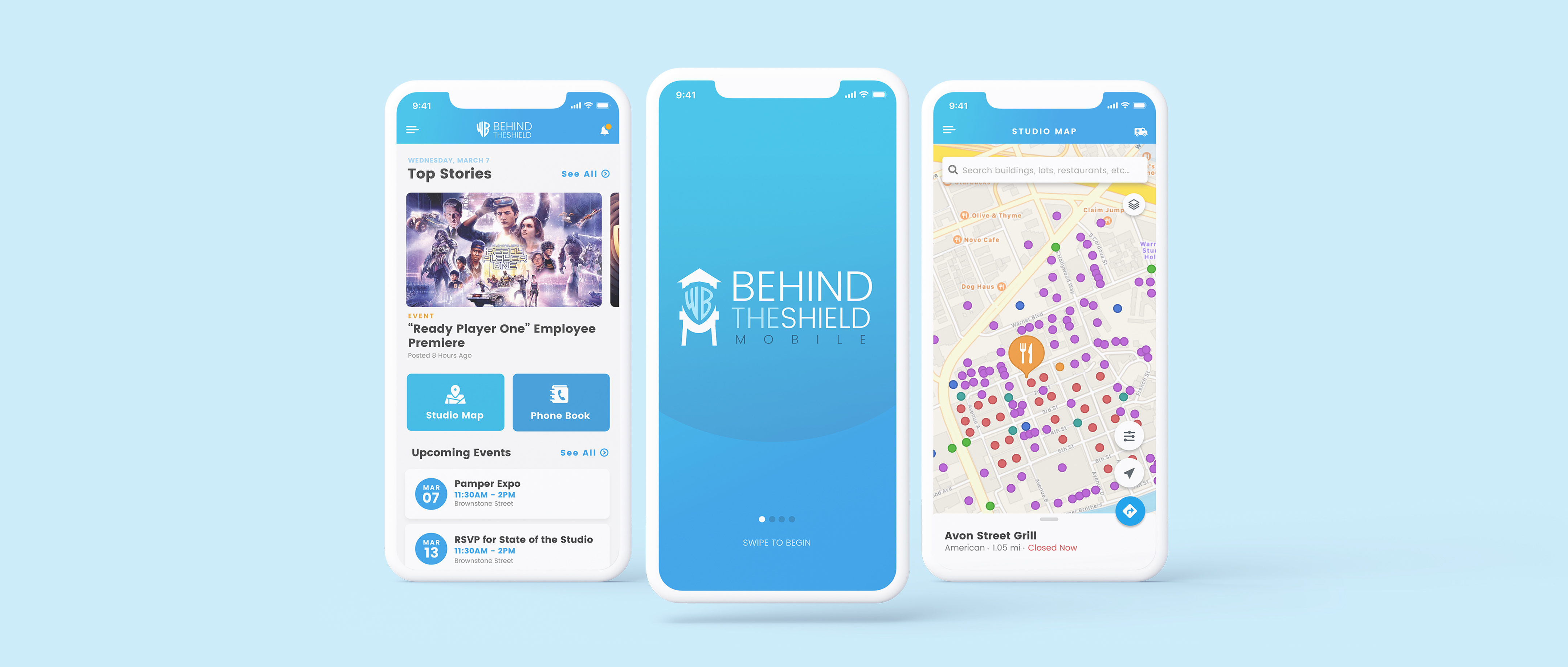
With the Behind the Shield Mobile application, Warner Bros. employees can get up to date look at the top stories, events and perks the company has to offer. The essential component of the app, however, is an interactive map of the Burbank studio lot. This allows the user to easily navigate the numerous buildings, stages and gates throughout the studio.
Research
It was important to identify the pain points for users in terms of navigation throught the studio lot. Guests and employees can request a map upon entering the studio - an inefficient way of navigating. While addressing these issues, it was also impertive to coalesce the most utilzed tools of the WB employee intranet.
A Flimsy Way of Getting Around
The Warner Bros. Studio Lot can be challenging to navigate once inside - not all streets are marked, and it's sometimes hard to distinguish buildings from stages and offices. Before this project, the only way for employees and guests to get around was to use a paper map, which has its advantages but doesn't provide much context to where someone is or how to get to a specific, unmarked location.
"...I always get lost when I'm on the Lot"
"...there should be a Google Maps for the Studio"
User frustrations (as well as my own) from these suggestions and subsequent interviews/research further reinforced that a more modern navigating the studio would be beneficial.
Product Management Interviews
It was important to gain insight into how users (employees) were interacting with the desktop version of Behind the Shield so I could start defining an ideal feature set for the mobile instance.
I conducted several interviews with the product managers of the application who were able to use Google analytics reports to show which areas of the application employees were engaging with most over time.
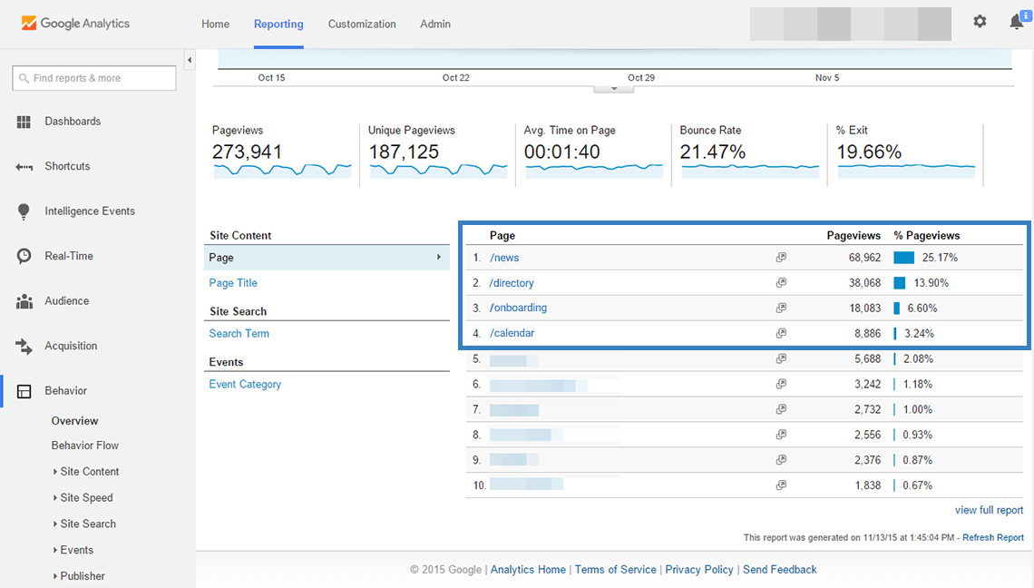
After assessing the trends, I was able to compile a list of data-driven features that would work best within the framework of a mobile app. I met with stakeholders to go over my suggested feature set, and after some back and forth, we managed to come to an agreement that the intranet features to be included within the app would be a “lite” version of the existing desktop instance.
Brainstorming
Now that I had defined which features to include and validated the need for a better navigation tool for the studio, I needed to devise a solution for coalescing the two within the context of the app.
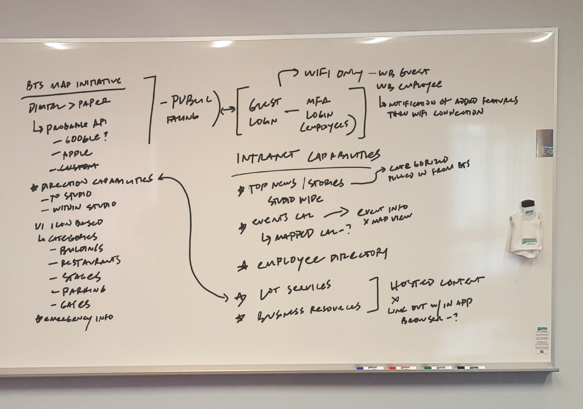
I worked with product management to brainstorm how best to allow accessibility to which features and capabilities over the company network types versus off. We also began to identify which useful map features could realistically be included within the project timeline.
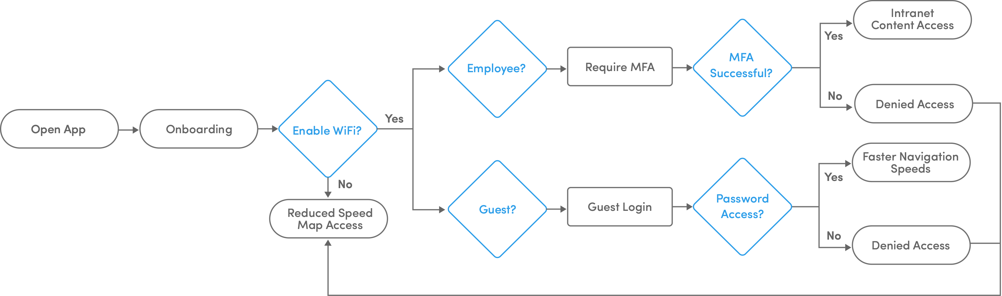
User Login Flow
The first step was getting the flow for the expereience based on the users network access right. The company-wide wifi for the contains two tiers: one for employees and another for guests. Since the employee network requires MFA to get behind the firewall, only employees would experience intranet-related features of the app. On the other hand, guests would have limited access but still could obtain higher data speeds and utilize the studio map.
Ideation
After addressing paint points, formulating solutions, and getting feedback from stakeholders, I began creating concepts for the primary components of the app.
Lo-Fi Wireframes
With working through preliminary sketches, I was able to visualize how the intranet-based features would integrate with the studio map. I also knew the map would need to be accessible independent of the larger feature set; ergo, users on the employee network would go through a different login flow than guests (if either chose to access network wifi).
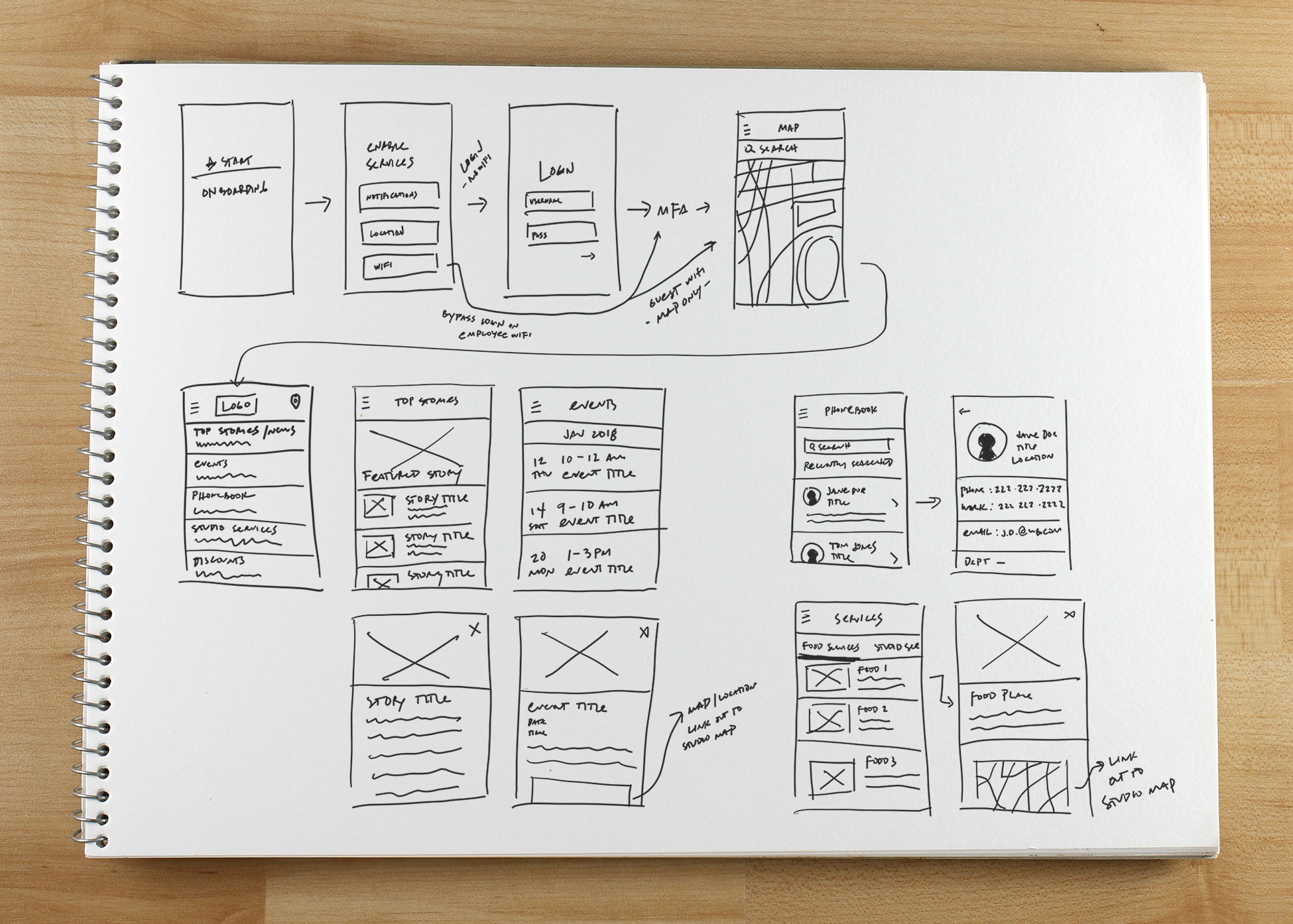
After getting a foothold on the flow and function of the intranet features, I shifted focus to the studio map tool. I was able to confer with project management on the minimal viable features the map should have and then assess if those features could be engineered within our timeline.
Based on my research, I knew a pain point for users was getting lost within the studio and not being able to distinguish landmarks. In this case, I thought integrating directions into the map would prove to be a valuable asset. I wanted to provide users with additional information regarding studio services, such as the function of particular buildings or menu options at various restaurants.
Once I finished working out the major components of the app through wireframing, I created a simple prototype to walk product management and our stakeholders through. After a few iterations and everyone had confidence in the design, I began work on visual design.
Design
For the UI, I followed the existing design guidelines for the desktop version of Behind the Shield with some minor color and icon tweaks to distinguish it as a new version of the tool. I utilized a limited color palette with pops of bright color with clean, sans-serif fonts for ease of use.
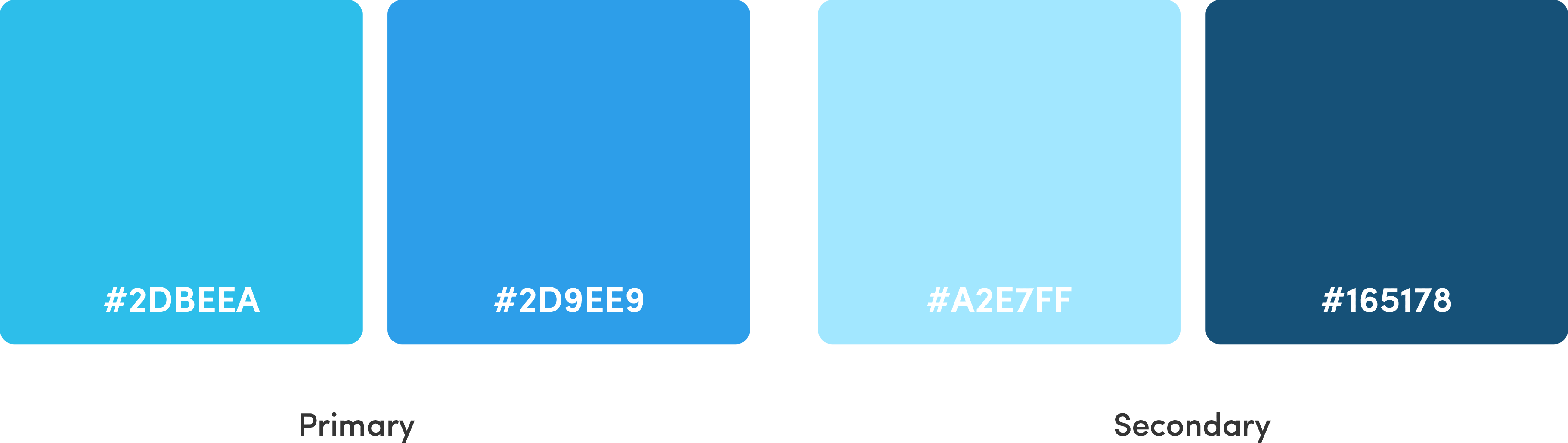
Colors
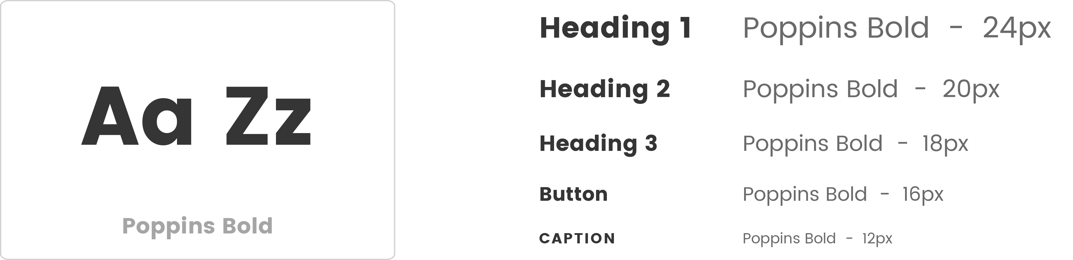
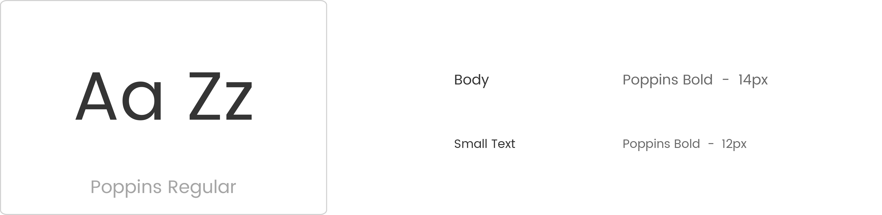
Fonts
Icons
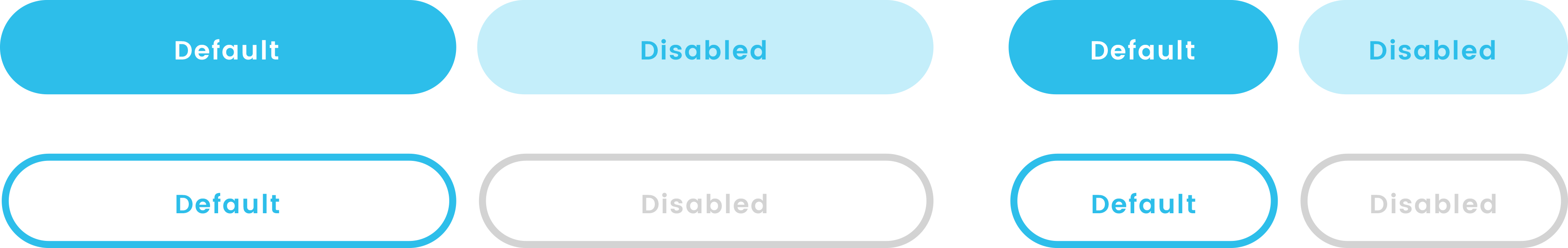
Buttons
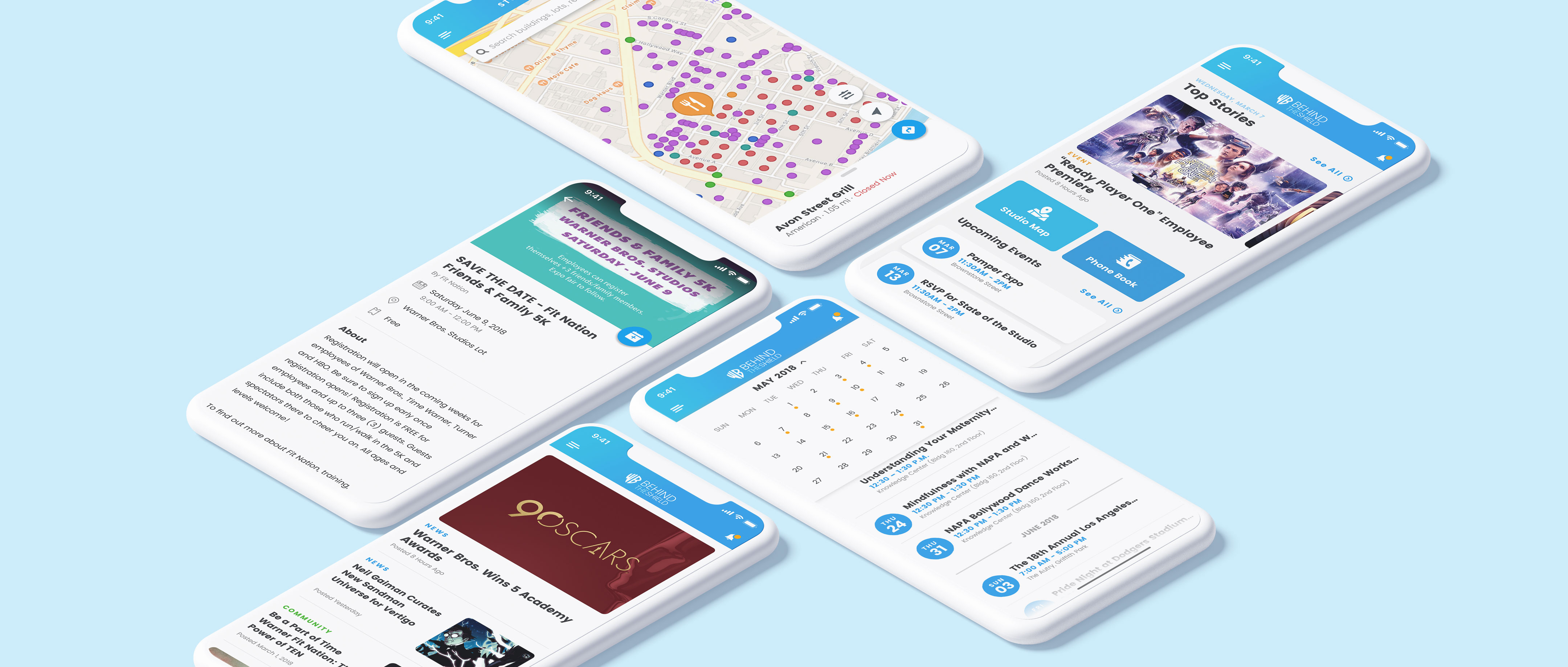
Final Solution
Once I had worked out the design system, I began to design out the app's more visual elements and refine specific interactions. As I would ultimately need approval on final designs from engineering and stakeholders, this process was also iterative. Below are the final results of the design phase.
Onboarding
Introduces users to key features and provides the option to turn on geolocation services and notifications on one screen. Also displayed is a message suggesting that to access the full benefits of the app, it is connecting to one of the company wifi networks is recommended.
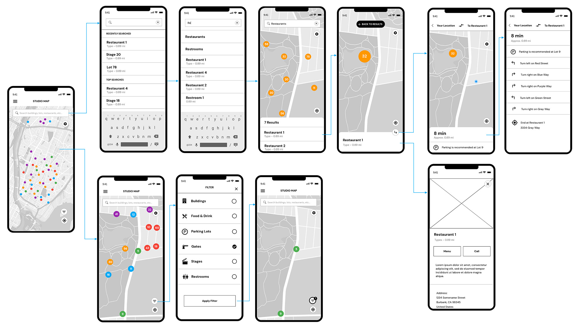
Targeted Location & Directions
Studio map points are color-coded and contain icons based on type. Tapped pins will provide users with more information on that specific location and the option to get directions from wherever they currently are in the area.
Map Search
Intuitive search functionality recognizes and recommends the most common destinations within the studio. Custom searches utilize typeahead to provide quick and helpful suggestions.
Phonebook
A robust people directory that allows users to search and find any employee within Warner Bros. Provides data on the emplopyee's title, organization, location, and contact information.
Events Calendar
An easy-to-use company-wide list of employee events. There is also the option to toggle a more traditional calendar view for events that occur further in the future. Studio map functionality is also tied into the details of each event to get an accurate picture of the location.
Key Takeaways
Behind the Shield Mobile would be one of the first significant products I'd have the pleasure of working on at Warner Bros. It was also my first introduction to designing for an enterprise technology product. I had to think about the approach and strategy, as the tool would be for a specific subset of users. However, as I was acquiring data through research, I found that it was still necessary to listen and address those users' needs and frustrations and devise a design that solves them.
It was also essential that the prioritization of app elements be data-driven to determine which could be designed and built within a given timeframe. Had I not researched which areas employees were hitting most on the intranet, the mobile version had the potential to become a heavy, convoluted set of links and drill-downs. Fortunately, I advocated for a more streamlined version of the intranet portion that stakeholders ultimately approved.