TechStatus
A no-frills, on-demand service status checking app
Overview
In early 2019 I was tasked with creating an easy-to-use mobile app for employees that could monitor the health of services (apps, websites, servers, etc.) company-wide. There had been no practical solution for this, which was a point of frustration for employees within tech organizations across Warner Media. The solution provides users with pertinent data around outages, maintenance updates, and overall health of services company-wide.
Role
Research, Ideation, Wireframes, Interaction, Visual Design
Team: 1 Designer, 1 Product Manager, 1 Software Engineer
March - May 2019
The Problem
There was no real solution for tech business units to get a real-time overview of how different services were performing. Issues with these services could only be determined through direct product owner reports from crash detection and proposed maintenance schedules coming directly from their engineering teams. I was tasked with presenting a solution that could track these issues and provide the cause and history of them in one central location.
The Solution
TechStatus is an intuitive application that tracks the health and status of services across all Warner Media Brands, including Turner, HBO, and Warner Bros. Users can add those services most relevant for them to a personal favorites list. Also included is a Calendar to track upcoming maintenance and a mechanism for submitting issue reports.
User Research
As an initial step, it was important to get a better understaning of who the target user of this type of application was. After brainstorming some hypotheses on user types, I decided to formulate a list of objectives to validate through user research.
Qualatative Interviews
Myself and product management arranged quick meetings with stakeholders and various teams within the business unit (WB Tech) - these ranged from engineering and ops, all the way up to executives and upper management (when time permitted).
Interviews primarily centered around the following objectives:
- Who is the target user(s) of this product
- Understanding users need for the product
- Understanding what data would be most helpful
- Features that would help facilitate user goals
Insights
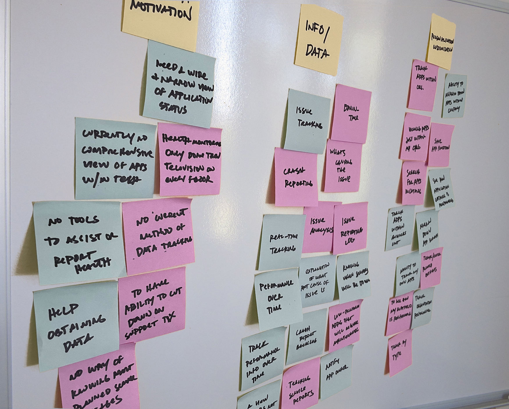
From the user and stakeholder interviews, I was able to better understand user expectations, needs, and motivations. I categorized our findings into two primary drivers:
Data Driven
- Severity, cause and duration of issues as they occur
- Current performance of all applications company-wide
- Testing and fix/solution log
- App owner and org info
- Performance of applications over time
Feature Driven
- Some users only need to view health of certain apps
- Some users need a wide view of applications across an org
- Report when apps/services will be down or when errors occur
- Find specific applications company-wide
User Profiles
Although there was definitely potential for overlap, our research made it evident how different users would use the app differently. To cater to this, I categorized them into three user profiles based on their goals and tasks.
1. Executive
Oversees an entire organization within one of the WarnerMedia Brands (eg, Warner Bros, HBO, etc..) & teams associated within these brands - product managers, directors, and ops teams.
Needs
- Horizontal view of products within the business unit/org to address issues
- Seeing overall performance of an organizations products and services
- Easily move between data within different orgs
2. Product Manager
Owns and is responsible for products within their portfolio. Oversees teams dedicated to building and maintaining these products.
Needs
- Track and report issues affecting service/product
- Real-time monitor those services with potential issues before major ones occur
- Ability to see a narrow view of services
3. Engineer (Ops)
Builds and maintains a specific product(s) & is responsible for addressing any issues and executing solutions for them. Only reports and tracks issues within team (most of the time)
Needs
- Notify org of updates or new builds that will effect the health of a product
- Log solutions for product issues
- Ability to submit and track service tickets when issues arise
After assessing the information from my compiled research, I was able to get a better idea of how different users would interact with and consume the data. I began brainstorming with product management on a proposed feature set and on what data to display. Early concept ideation helped facilitate this.
Ideation
Settling on the feature set and data layout was an iterative process rooted in the information compiled in our user profiles. It was also essential to run any progress by engineering to assess a feature's level of complexity and if it could be built within the project timeline.
Early concept sketches
Considering the needs of specific users, I began creating some initial sketches to map out what data to include and how to display it. I decided to break out the issues into three distinct buckets - services that are down, those in trouble, those currently in maintenance. All other services free of issues would display as stable.
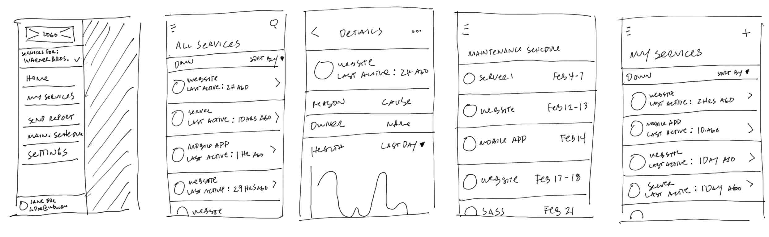
I also began to propose features based on user needs. For instance, since our Product Manager profile would only need to see specific services, my suggestion was to include a bookmark or favorites section to save them independent of the full service list.
Lo-Fi Wireframes
Once I felt confident about what to include in the app, I conferred with Product Management and engineering to make sure we agreed with the data and feature set. From here, I began creating lo-fi concepts and, ultimately, a functioning prototype outlining the necessary user flows.
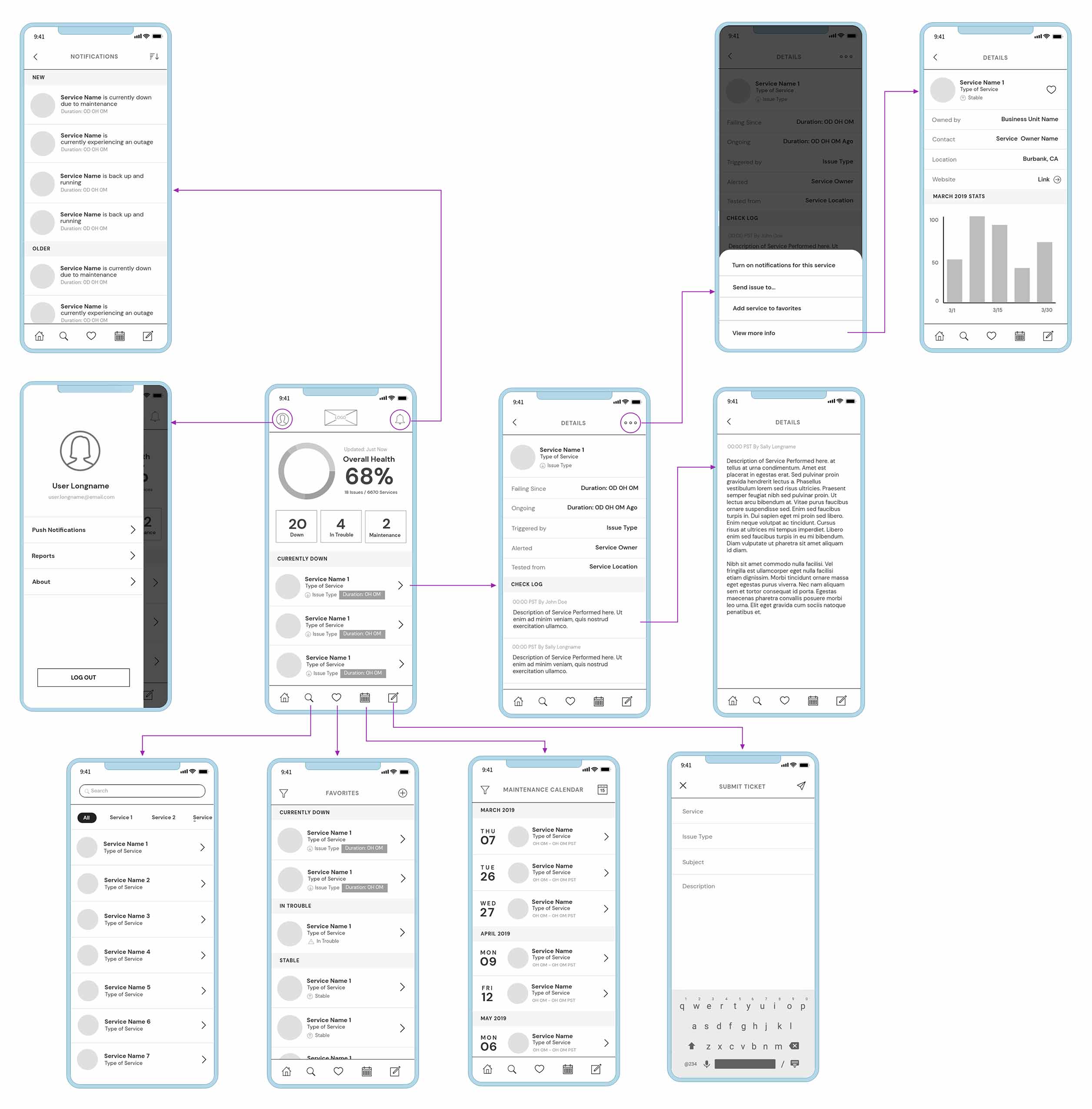
Feedback
Getting feedback on the direction of the project from Product Management, engineers, and other stakeholders was an essential step before moving on to the final design. It was also an invaluable way of testing the prototype on each specified user type since they would be the ones engaging with the app most.
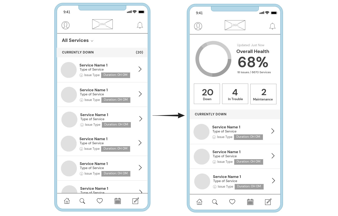
A visual way of displaying health
Issue
Early wireframe concepts for the Home Screen were a bit bland. Although there was no real issue with displaying the information this way, I felt a better solution to handling this.
Solution
I decided to introduce a donut chart that would evaluate the overall percentage of service health and provide a visual way to view key metrics. After incorporating the chart and presenting it within the prototype, stakeholders responded positively to the change - especially after seeing the final design.
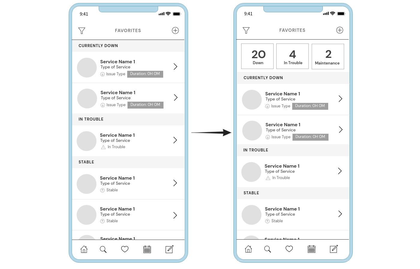
The importance of favorites
Issue
Although the consensus favored adding favorites as a function, there was some objection to how its panel would display. In the initial prototype, I had proposed a simple list view solution. However, some stakeholders felt the visual indicators should be the same for favorites as those on the homepage. My stance, in turn, was that it would be redundant and difficult to distinguish between the two screens.
Solution
After some revaluation, I proposed a solution that would keep some visual elements from the dashboard but still allow favorites to be distinct.
Design
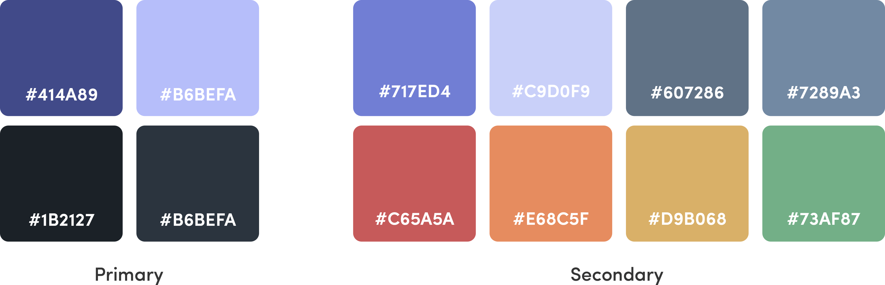
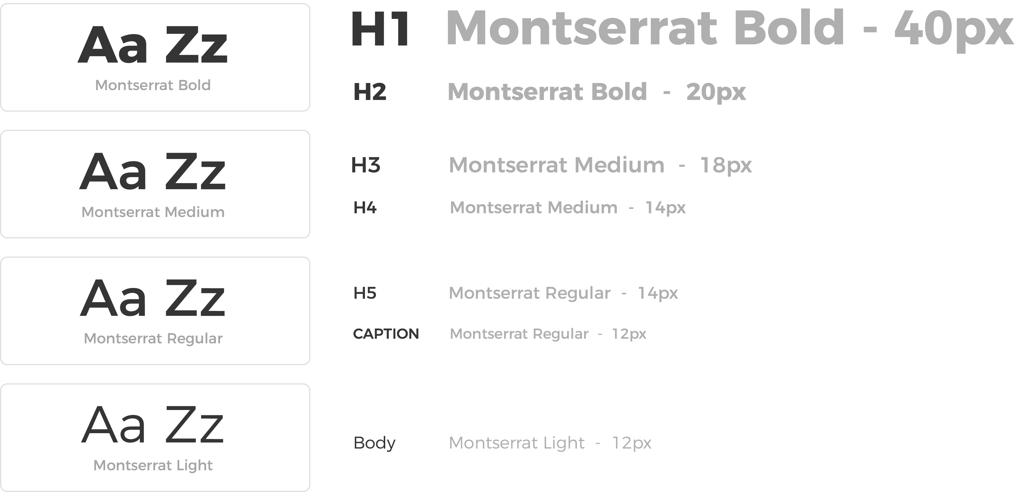
With the design of the UI, I knew I wanted to color code issues based on type. The brightest, warmest colors would represent issues with the most urgency and green, stable services. To contrast these accent colors, I decided it would be best to use an overall dark color palette composed of cool grays and violets to make them pop. With dark UI, it’s also vital to maintain contrast for legibility, and as such, I kept most text blocks pure white and used an easy-to-read sans serif font.
Colors
Fonts
Icons
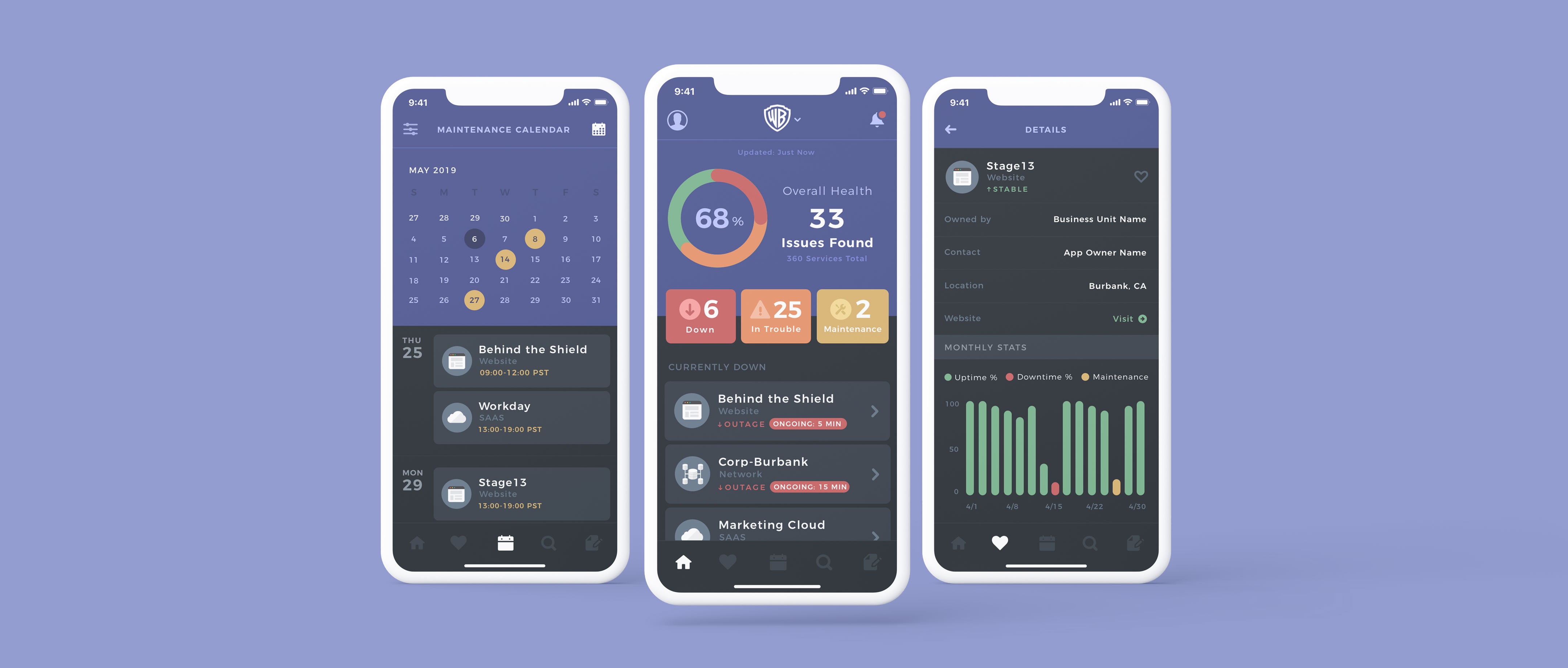
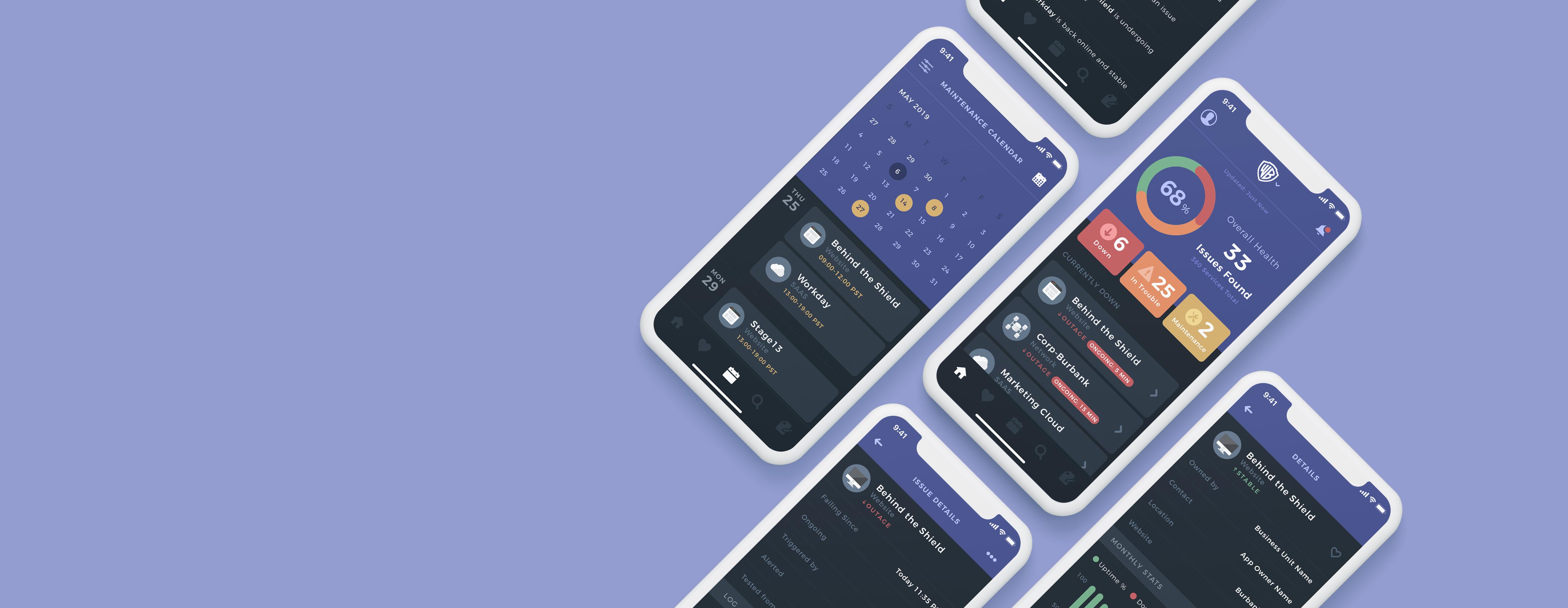
Final Solution
After achieving a balanced and effective design system, I applied it to the finalized wireframes and began designing the necessary interactions. The following are walkthroughs of the final features of the app and its user flows.
Dashboard & issue report
The initial view displays the overall health gauge for a particular brand within WarnerMedia The brand can be switched using the toggle at the top. Also shown are the sets of current issues ranked by severity. Users can click the service to get a detailed report of the problem and any updates on it.
Favorites
Allows the user to search for and add services to a personal list. From here, a separate panel is displayed to provide a health report for only those specific services.
Maintenance Calendar
Lists scheduled maintenance dates and times so users can plan for when services will be down. The calendar is also filterable and provides a detailed view of the reason for maintenance.
Search
The intuitive search capability allows users to find services quickly using typeahead. The tabs at the top also allow for easy navigation through the different service types.
Issue submission
When issues are detected with a particular service, the app can create a report that will notify the service owner. Users search and select the service, decide the type of issue and then create a summary report before submission.
Key Takeaways
Although knowing TechStatus would be a tool for a small subset of employees within my business unit, I still felt that a more user-focused approach in the initial research phase would prove beneficial. It was essential to identify the primary users of the app and get their input on what data sets would be most helpful and what they hoped to accomplish with the app. Engagement with these users proved to be an invaluable research method. It informed me of what information to include and identify their need for the product. In turn, this made the process of devising a feature set slightly easier.
It was also essential to allow for user input within various stages of the design process to make sure that the data and features included aligned with the needs of each user. In the end, the app's launch was successful, and it was lauded for its design throughout WarnerMedia.